Conversational UI in Rural Context: Enlightening User - Testing
TL'DR
As a designer, the last thing you want to hear after working on user flows, wireframes, mockups, and interfaces is that the users “don’t quite get it”. And yet, these are the “failures” that force you to take a step back and rethink your basic assumptions. I’ll be talking about one such failure we encountered while testing an app recently, and why it was an eye-opening experience.
But first, a quick primer about the app in question:
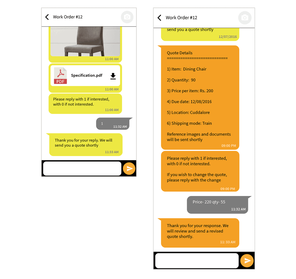
We were tasked with designing and developing an app that allowed the client to send work orders to a network of rural carpenters in South India. They could choose to take up the job and keep the client up to date with the progress (by sending photos etc.) thereby reducing the workload on the client reps in the field. The app needed to go out with two language options (English and Tamil) to start with, and the client planned to test it with a small group of carpenters to see how viable the solution was. The catch, was that most of these carpenters (our prospective users) had never used a smartphone (they were still using dumbphones), and the ones who did use a smartphone only used it to make calls and send + receive messages using SMS and WhatsApp. The carpenters without smartphones were provided one for testing.
We thought this offered a wonderful opportunity to try out a “chat-like interface” or a conversational UI to communicate with the workers as messaging seemed to be a common factor between both types of users. The fundamental interaction would imitate the way phone users choose services like internet data packs, ringtones, etc. with their service providers in India:

A sample interaction most Indians are familiar with
Although the interaction imitated an automated backend, there was human monitoring the conversations, which allowed the carpenter and the client rep to converse when necessary.

Yup, we were pretty excited, and after developing the test build of the app (in record time I might add, we ❤ our devs!), we handed it over to the client for testing. Now here comes the kicker — we get reports that the carpenters “don’t quite get it”.

We thought we’d kept the experience simple and familiar, but learned that there was a vital aspect of the interaction we hadn’t taken into account.
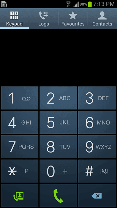
You see when the carpenters got a prompt to “enter 1 for yes or 0 for no”, they ignored the text field at the bottom completely. Instead, they navigated to a screen they were familiar with for such interactions…
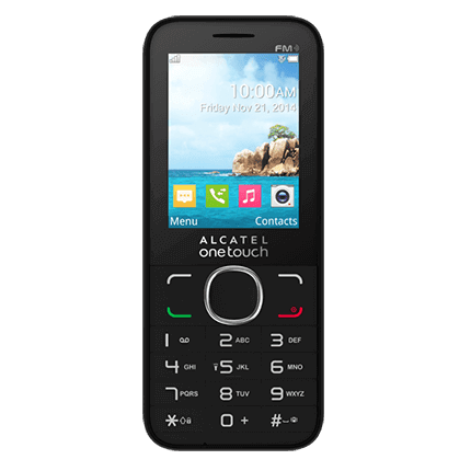
Yes, the dialer app. Puzzled? Don’t be. Because dear reader, I have a confession to make — I haven’t been entirely honest with you. I misled you on a key detail when talking about the automated SMS interface earlier. You see, most carpenters didn’t use a smartphone to choose their ringtones or their data packs. They used one of these:

Therefore, when faced with the numeric options, they did what was logical - give input through the dialer, which is how they did it in the dumbphones. We were the ones who should have been more careful about our assumptions. This was a wake-up call for us and we learned that we need to review every interaction we had taken for granted in the app.
Smartphones are getting cheaper and proliferating at all levels of society (especially in India). These are tools for users like carpenters, not toys, and they will probably not have the luxury of learning its UX language in a laid-back manner (like many of us did). We’ll need to keep this in mind when designing for them. And we look forward to more “failures” like these to understand them better in the coming months.
P.S. For those interested, we’re currently testing a version with selectable options when numeric input is necessary.


.png)
.png)
.png)
.png)
.avif)


